Ghidul Mamei: building a mini-site for a digital guide
Author story, contents, packages and WhatsApp ordering: explore the Ghidul Mamei mini-site and apply its presentation decisions to your own digital product.
Contents
A digital product needs a presentation that makes it possible to assess before purchase. Visitors cannot pick it up from a shelf and browse through it. They need to understand the subject, author, contents and access arrangements from the information available on the website.
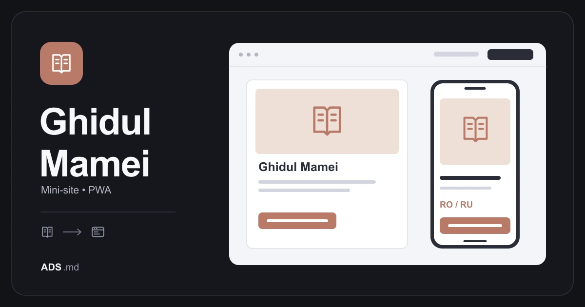
Ghidul Mamei presents the guide “Înțărcarea blândă”. The documented project includes a Romanian and Russian mini-site, packages, WhatsApp ordering and a PWA. This article explains those decisions and proposes checks for similar projects without attributing sales or health outcomes to the website.
Define the product before its visual identity
The starting point here is an editorial guide presented through the author’s experience. The website needs to preserve that personal voice while explaining the commercial offer separately. The story establishes where the material comes from; the product description explains what visitors can assess and buy.
For your own guide, prepare a short product sheet: subject, audience, format, language, included content and delivery method. If a supplementary resource does not yet exist, mark it as planned in the project documentation. Publish the package when its materials and delivery process are ready for buyers.
A sensitive subject requires careful wording. One person’s experience does not demonstrate that other families will follow the same path. The Ghidul Mamei presentation maintains that distinction; this article concerns digital product organization rather than providing health or care recommendations.
Use the opening screen for orientation
The opening screen should answer three questions: what the material is, whom it is for and where to learn more. A relevant image and precise heading can provide context without a long list of promises or several equally prominent actions competing for attention.
The project’s calm visual identity supports reading. For a similar mini-site, check whether background, contrast and spacing make the text comfortable to read. An appropriate atmosphere should not depend on pale lettering or headings that occupy the entire phone screen.
Explain the action before asking people to take it. “Discuss the guide” and “Get access” create different expectations. If a button opens WhatsApp, its wording should announce a conversation rather than suggesting that the purchase is already complete.
Let the contents explain what the material offers
A contents list is an evaluation tool. It shows the topics covered and allows someone to compare the material with their questions. In Ghidul Mamei, the contents and package differences appear before ordering, alongside the author’s story.
For a new product, describe chapters through what they actually cover. “Preparation, examples and frequently asked questions” is useful only if those elements exist. Avoid saying that a guide contains everything; clear boundaries help buyers as much as an explanation of potential benefits.
You can prepare an editorial sample when you have the necessary rights and it accurately represents the product. An attractive cover communicates identity but does not demonstrate writing style. Label the preview and make clear which portion is available before purchase.
Compare packages through concrete differences
Packages should explain what buyers receive in each option. Use the same criteria in the same order: material, format, language, access and any additional components. A package name should not be the only clue to how it differs from another offer.
Do not assume more options make choosing easier. Two distinct packages may be sufficient for one guide; a single option may work better for another. Decide the number through actual differences rather than the number of cards that look attractive in the layout.
Review packages with whoever handles orders. Price, contents and delivery explanations should match the answers given in conversation. If buyers must ask again what the offer includes, identify the missing information and improve the page rather than repeatedly explaining the same point.
Prepare the WhatsApp continuation
In Ghidul Mamei, buttons begin a discussion about the package and access. That creates room for questions before payment. The documented flow is conversational ordering; it should not be described as automatic checkout and delivery unless those capabilities are independently established.
For a similar project, prepare an opening message mentioning the guide and selected option. Avoid a lengthy form before the conversation. Request only the information subsequently needed for the order, without personal questions that do not contribute to delivering the product.
Define what follows the first message: who replies, during which hours and how receipt is confirmed. A working button is only the beginning of verification. Test the complete journey with an explicitly identified test enquiry and fictional information.
Translate every decision point
Romanian and Russian versions form part of the project. Translation needs to cover the offer, packages, questions, contact and information pages. A translated menu does not fix a commercial description left in another language, particularly when somebody is checking exactly what they will purchase.
Compare meaning rather than matching string lengths. A Russian heading may need different line breaks from its Romanian equivalent. Let components grow and check diacritics, Cyrillic characters and the prepared WhatsApp message separately in each language.
Treat the PWA as a way to return
The documented PWA provides a way to return to the web experience. Installation and behaviour depend on the device and browser; MDN’s guide explains the requirements. An installed icon does not demonstrate offline access to the complete product.
For your own guide, decide what a returning visit opens: the presentation, contact or a separately implemented access area. Test a disconnected device as well. If the material needs internet access, explain that instead of leaving the user with an unexplained empty screen.
Verify the foundation before expanding the offer
Walk through the mini-site on a phone: identify the guide, find the contents, compare packages and begin a conversation. Check information pages and controls for nonessential tools. These elements support the offer; their presence does not replace testing their actual behaviour.
A course, blog or community can become later developments, but they are not implied deliverables of this mini-site. Expand when content and a delivery process exist. The useful lesson is the clear relationship between presentation, selection and access at each step.
Sources and documentation
Your notes
Notes stay in this browser.