ADS Moldova: updates from 12 September 2026
Language-specific URLs, a more practical AI chat, configurable cookies and six Live projects: the changes and why we made them.
Contents
On 12 September 2026, the ADS Moldova updates continued beyond the appearance of individual pages. We worked on language-specific addresses, the AI chat experience, cookie preferences and consistency between services, the portfolio and the homepage. At the same time, we refined the information pages and corrected details that were particularly noticeable when browsing the website on a phone.
This article describes changes published by the time this journal was written and explains the purpose of each one. It follows the updates from 11 September. The examples explain our decisions; they are not sales measurements or promises about Google rankings. Where a feature depends on a browser or an external service, we keep that distinction clear.
Separate links for Romanian, Russian and English
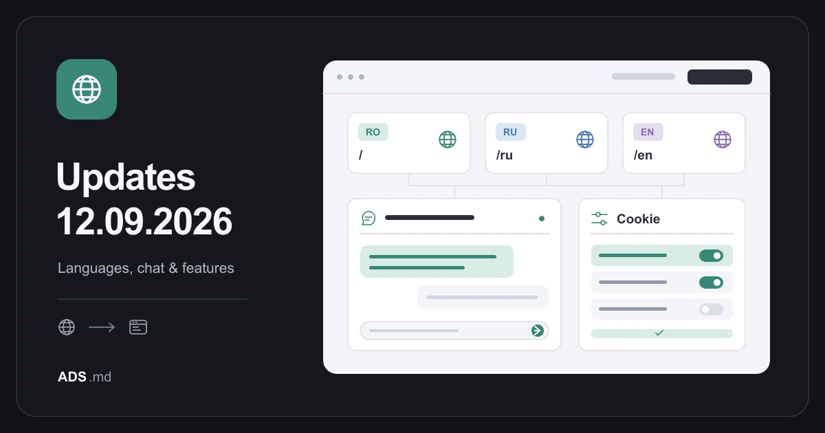
The main navigation change is the introduction of separate addresses for each language version. Romanian keeps the usual URLs, Russian uses the /ru prefix and English uses /en. When you change the language of a public page, its address changes too. You can copy that link, send it to a client and return directly to the version you selected.
This solves a practical advertising problem: an English campaign can link to the English website development service, while a Russian campaign can use the Russian version. The landing page no longer depends solely on a preference previously saved in the visitor's browser. That preference might not exist on a first visit or on another device.
One platform with localized versions
Separate URLs do not mean three independent websites that must be managed separately. We retained a shared structure for pages and components, with localized text and metadata. This helps us apply corrections consistently: a navigation control or a display rule can be improved in the same codebase while preserving the appropriate content for each language and its visitors.
There is still more content to maintain because translations need checking. We corrected sections of the Russian homepage that displayed English text or left project fields empty. Banners, labels and actions should communicate in the same language as the rest of the page. Translating a language selector alone cannot fix a missing description further down the website.
An aligned sitemap and language signals
We integrated localized versions into the sitemap and checked canonical addresses, connections between languages and page metadata. An English page should identify its own address and connect to its Romanian and Russian equivalents. Those relationships need to follow the same structure in navigation, search engine information and links that people share outside the website, including links used in advertising.
Google recommends different URLs for language versions. A sitemap helps discovery but does not guarantee indexing or rankings. We also checked public access rules, crawler guidance documents and continuity of existing scripts. These checks are not evidence that an AI system will automatically cite the website in an answer.
AI Chat: more space for the conversation
The AI Chat page received a more practical mobile layout. The message area and writing area now have clearer boundaries, and elements that overlapped were reorganized. The aim is to let someone read an answer, write the next question and find the important actions without having to work around the interface, especially on a smaller screen.
We improved access to history, conversation search, answer copying and text export. Switching conversations should not mix a delayed answer into a discussion opened in the meantime. We addressed these situations and retained controls for stopping and retrying a request when someone needs to correct a question or make another attempt, keeping the state of the conversation easier to follow.
Clearer explanations of errors and files
We reviewed what happens when the chat cannot obtain an answer. An error should not be presented as though the assistant had supplied a valid response. The interface explains the problem and allows another attempt, while making the conversation state easier to understand. This matters when someone needs to distinguish actual requested information from a message about the system's operation.
Attachment guidance now reflects the accepted formats: PNG, JPEG and WebP images, plus TXT and Markdown text files, within the limits displayed in the product. We do not imply that every uploaded document can be processed. On phones, we checked long filenames and multiple attachments so they do not hide the writing field or the action used to send a message.
Cookie preferences that show and retain your choice
The cookie banner had controls that were difficult to interpret. We redesigned the presentation of categories, with visible enabled and disabled states and a separate explanation for strictly necessary items. These are marked as always active, instead of showing a switch that suggests a choice which is not available. The remaining categories can be configured and saved using clear controls.
We checked reopening preferences, cancelling unsaved edits and withdrawing consent for optional categories. On small screens, the save actions need to remain accessible. The cookie information page explains the context in which cookies are used. This update describes product behavior; having a banner does not mean that every possible future use of data is automatically appropriate.
Six Live projects, one selection in two places
We synchronized the Live projects section on the homepage with the Live filter in the portfolio. At the time of this journal, the selection contains Karma Numbers, BB Fliesen, AI Moldova, Metropolis, Kirsan and IsoTherm Lux. Using the same selection reduces the risk of a project appearing in a different category simply because it is displayed on another page.
The labels still distinguish projects in development from collaborations with active marketing. Portfolio status describes the relationship presented by ADS Moldova; it is not a permanent technical certification of the external website. We kept completed projects in their category and removed the lengthy explanation beneath the carousel. Visitors can reach the project and its case study with less intervening text.
Website examples chosen for a relevant first impression
On the website development and landing page service pages, the first examples are Karma Numbers, BB Fliesen, IsoTherm Lux and AI Moldova. This order introduces different visual and functional directions before the other existing examples. Visitors can explore a content platform, a service website, a local business presentation and an AI product without treating those distinct projects as interchangeable demonstrations.
Each recommendation retains the description of our actual contribution. Changing the order of images does not change what was delivered for a client. For a closer look, the IsoTherm Lux case study and AI Moldova case study provide context beyond the opening screenshot. The selection supports comparison; a gallery should not replace the explanation of the work behind each project.
Website VIP and online stores: distinct offers
We corrected the name and benefits of the highest package in the website development service. It is now Website VIP, with the starting price retained at €650. Its description focuses on a premium website: custom design, service and portfolio pages, interactions, advanced forms, content management and technical optimization. The translations and the prepared inquiry message were updated together with the package.
The purpose is to distinguish the offers. ADS Moldova already has a separate online store service, and presenting the largest website package as e-commerce created an overlap. A client looking for a sophisticated presentation website should find an appropriate offer without assuming that the higher tier necessarily includes a product catalog and a purchasing process they may not need.
More compact pages with touches of color
We refined the About, Contact and Download the app pages by reducing oversized headings and simplifying some cards. After that, we brought color back to icons and actions, including on AI Services and Tools. The goal is a balance: information that is easy to read, with enough visual differentiation to help people recognize functions and find the important buttons.
On the app page, we kept the images and video. The update concerns their organization and proportions, rather than removing useful material. The PWA experience was also checked in relation to the website's languages. Browser access and installation should lead to consistent content, while the instructions need to account for differences between the devices and browsers that people use.
Real tools and shorter banners
The Tools section now presents a more balanced set of technologies for development, design, SEO and communication alongside AI. Next.js, Figma, Adobe, Semrush, Zoho Mail and Blender help explain different activities. The list does not mean that every project uses every product or that a subscription to those products is automatically included in a service package.
We also made the website template and ChatGPT offer-check banners more compact. The question preview can be opened when needed, instead of permanently taking up a large area. Users can see what they are about to submit and edit the question. The feature opens an external tool; its response remains material for analysis that should be considered in context.
Easier blog reading and current project screenshots
We finalized the reading structure prepared the previous day: a better-proportioned text column, short paragraphs, a table of contents that opens when needed and direct links to sections. The blog now communicates its topics more clearly: websites, automation, tools, marketing and SEO. Design is one part of that scope, rather than a complete description of all the available articles.
For MDStore, we replaced the illustrative image in the portfolio and case study with an actual screenshot supplied for the project. We also corrected its framing. Elsewhere, we removed a duplicate carousel image and simplified the visual chat launcher. These are small details, but across repeated visits they affect the consistency of the presentation.
What we checked and how to use the updates
Our checks covered loaded images, correct links, language versions, mobile and desktop pages, filters and important actions. For chat and cookies, we also checked error situations, rather than only the path where everything works immediately. These checks document the behavior tested; they are not a guarantee that every device or external service will respond identically at every moment.
When preparing a campaign, use the page URL in the language of the advertisement. When choosing a service, compare the examples and described contributions before checking the appropriate package. You can start questions in AI Chat or continue through the contact page. The direction for this day is a more consistent website: the same offer, language and projects, clearly presented at every entry point.
Sources and documentation
Your notes
Notes stay in this browser.